
The story behind Brian Bonislawsky’s ‘Original Surfer’ font

Brian J. Bonislawsky is a very discreet and off-the-radar font designer. Nevertheless, his professional experience and legacy are rich and spread throughout the world.
You could ask, “What does typography have to do with surfing?” Nothing and everything, one could reply.
Fonts and typefaces are everywhere.
They pop without asking for permission on our phones, in newspapers, on street shop signs, food packages, magazines, billboards, traffic signs, and even on the clothes and shoes we wear.
For instance, you’re reading this article in a Roboto font.
There is not a single day you’re not exposed to more than a hundred different font families.
In other words, if you exclude handwriting, you cannot read a sentence that does not belong to a typeface.
Typefaces are also everywhere in surfing and surf culture.
From the moment you buy a surfboard, wetsuit, wax, and apparel to the surfing websites you visit and the YouTube videos you watch, there is always one or more typefaces making products or media more appealing.
And whenever you come across them, there is always someone behind the process of creating a style of letters, numbers, and symbols used in printing or electronic display.

The Road to a Surf-Inspired Font
Brian J. Bonislawsky was born in Pittsburgh, Pennsylvania, in 1973.
“I originally started lettering in 4th grade when my father gave me an old Speedball Lettering book,” Bonislawsky told SurferToday.
“I ended up hand-lettering in blackletter all of the school awards for years to come and was always trying to incorporate lettering of some fashion into my art designs through high school.”
“I went to Rhode Island School of Design (RISD) for college, thinking I would go into Graphic Design, but instead took all of the Graphic Design electives where you could break the rules, and instead majored in Illustration.”
“After graduating college with a BFA in Illustration, I worked for various t-shirt design companies in South Florida, creating designs for NASA, Disney, Coca-Cola, various cruise lines and theme parks… you name it.”
“Through those projects, I further honed my lettering and design skills and eventually started designing fonts in late 1996. I’ve been making fonts ever since.”
In the summer of 1996, he designed his first font, “ChickenScratch,” which he featured and made available as freeware on his website to see if he could create a usable typeface for the public.
Bonislawsky finds font inspiration everywhere, including advertisements, vintage ads, movies, music, and unexpected uses of fonts in various projects to create new fonts.
They start with sketches on paper to ensure consistency and explore variations before digitizing the designs.
Brian prefers this artistic phase over the technical and more mechanical aspects like point placements, spacing, and kerning.
His approach is intentionally more old school, probably thanks to his predominantly driven fine arts training.
Brian Bonislawsky founded the Astigmatic One Eye Foundry in 1996, which later developed into the Astigmatic One Eye Typographic Institute (AOETI).
Astigmatic aims to continually expand its typographic range, embarking on expeditions to revive old type styles, rediscover long-lost typefaces, create new and unique styles, and develop comprehensive language typefaces for the Windows Glyph List 4, including Greek and Cyrillic extensions.
Since the late 1990s, the Pennsylvania-born designer founded and co-founded several type foundries, including VersusTwin, Correspondence Ink, Grype Type, Pink Broccoli, Monogram Fonts Co., Breaking The Norm, Stiggy & Sands, and One Eyed Squid, among others.

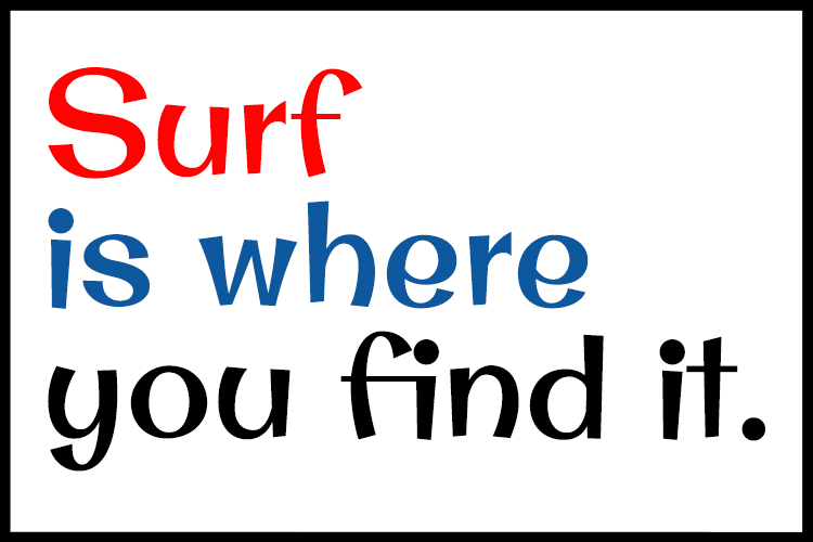
“Original Surfer”
In 2011, Bonislawsky designed a free Google Web Font called “Original Surfer.”
The typeface was inspired by an advertisement feature by California Cliffs Caravan Park, a holiday facility located in – surprise! – Norfolk, England.
The ad, published in Caravan Holidays in the 1970s, targeted English working-class families who could not afford a holiday abroad.
“Original Surfer” also reminds us of those classic surf movie posters from the 1950s, 1960s, and 1970s, announcing “new color surfriding adventures.”
It’s eccentric, fun, summery, outgoing, and breathes the California sound and surfing lifestyle.
Its creator underlined the “clear and cleanly legible letterforms, while nothing is formal or uptight about this [sans serif] font.”
But how does the “Original Surfer” end on Google Fonts?
“Stuart Sandler and I had gone out to California to meet with the Google Fonts team early on in the genesis of Google Fonts to discuss with them developing an array of typefaces to kind of kickstart the platform,” explains Brian.
“We were by no means the originators of the Google Fonts idea or the first fonts on it, but we were discussing developing fonts or a varied range and scope to add more to the Google Fonts platform.”
“They were looking for script styles, funky and fun display styles, handwriting styles, and more refined sans and sans serif typestyle.”
“So we each pitched a variety of inspired sketches to see what might appeal to them, and when it was all over, I think Stuart created about 30 fonts for Google Fonts, and I had created 58 fonts.”
Interestingly, Brian J. Bonislawsky confesses, “I’ve never had the balance to be a surfer or a skateboarder, though the idea has always fascinated me.”
“But now, at 51, I’m afraid I’d just break every bone in my body if I dared to try.”

The Making Of
The letterer and type designer shared some of the details behind making the “Original Surfer” font.
“I am constantly culling through Ebay for paper ephemera, and online through endless sites for visual reference for potential typeface inspiration, whether to be directly influenced by or just to spawn a new idea loosely inspired by something,” Bonislawsky reveals.
“I find my inspirations mostly through old movie titles, vintage hand-lettered ads, and greeting cards, to sometimes more abstract forms such as just listening to various music from electronic to metal to pop rock.”
“When I was putting together ideas for Google Font proposals, I had come across this ad for California Cliffs, and that blue lettering and the high contrast weighting of the lettering, and the offbeat styling just jumped out at me.”
“Even if Google would have turned down that font proposal for Google Fonts, I’d have created it anyway.”
“So many times, I see lettering in various ads and whatnot, and I can’t help but think it is such a shame that those lettering styles don’t exist as fonts or that they weren’t preserved somehow for future generations.”
“I like to think a good amount of my fonts are love letters to the original designers of those hand lettering tidbits, sometimes inspired by just a single word, sometimes from a small line of drawn text.”

A Summertime Flavor Typeface
Two years later, alongside Jim Lyles at Stiggy & Sands, the duo released the “Original Surfer Pro” font family, an advanced 2.0 version with additional customization options to give it more versatility.
“I am a huge fan of vintage ad lettering, and the sparks for this font show exactly that lettering love,” Bonislawsky told SurferToday.
“I don’t know what the original custom lettering artist for the California Cliffs Caravan Park was on when they drew this up, but you’ve gotta love the outright insanity of it.”
“The original lettering all of that hot fun in the summertime flavor – making summer vacation possible 12 months out of the year.”
“‘Original Surfer Pro’ tries to capture that original outrageous fervor and make it into something you can type at will,” continued the typeface designer.
“I’d like to think we captured the appeal of the original, but just the same, you have to give it up to the custom lettering artists of the 1950s through 1970s – they must’ve had a blast creating lettering for themes like this.”
The surfer-inspired Regular 400 typeface can be downloaded for free at Google Fonts.
Install it on your desktop computer and try writing “surfing” in 35 languages.
Words by Luís MP | Founder of SurferToday.com